TextField
A text field lets the user enter text, either with hardware keyboard or with an onscreen keyboard.
Example:
ft.TextField(label="Name", hint_text="Jane Doe")

Inherits: FormFieldControl, AdaptiveControl
Properties
always_call_on_tap- Whetheron_clickshould be called for every tap.animate_cursor_opacity- Whether the text cursor animates between transparent and opaque during each blink.autocorrect- Whether to enable autocorrection.autofill_hints- Helps the autofill service identify the type of this text input.autofocus- True if the control will be selected as the initial focus.can_request_focus- Whether this field can request focus.can_reveal_password- Displays a toggle icon button that allows revealing the entered password.capitalization- Enables automatic on-the-fly capitalization of entered text.clip_behavior- How the field's contents should be clipped.cursor_color- The color of TextField cursor.cursor_error_color- The color of the text cursor while the field is showing an error.cursor_height- Sets cursor height.cursor_radius- Sets cursor radius.cursor_width- Sets cursor width.enable_ime_personalized_learning- Whether the input method is allowed to learn from what the user types.enable_interactive_selection- Whether interactive text selection is enabled.enable_stylus_handwriting- Whether this field supports stylus handwriting input.enable_suggestions- Whether to show input suggestions as the user types.ignore_pointers- Whether this field ignores pointer events.ignore_up_down_keys- Whether to intercept Arrow-Up and Arrow-Down when this field has focus.input_filter- Provides as-you-type filtering/validation.keyboard_brightness- The brightness to use for the onscreen keyboard.keyboard_type- The type of keyboard to use for editing the text.max_length- Limits a maximum number of characters that can be entered into TextField.max_lines- The maximum number of lines to show at one time, wrapping if necessary.min_lines- The minimum number of lines to occupy when the content spans fewer lines.mouse_cursor- The mouse pointer to show while hovering over the field.multiline- Whether this field can contain multiple lines of text.obscuring_character- The single character used to mask the text whenpasswordisTrue.password- Whether to hide the text being edited.read_only- Whether the text can be changed.scroll_padding- Padding to keep around the field when a surrounding scrollable scrolls it into view.selection- Represents the current text selection or caret position in the field.selection_color- The color of TextField selection.shift_enter- Changes the behavior ofEnterbutton inmultilinetextfield to be chat-like, i.e.show_cursor- Whether the field's cursor is to be shown.smart_dashes_type- Whether to allow the platform to automatically format dashes.smart_quotes_type- Whether to allow the platform to automatically format quotes.strut_style- TheStrutStyleused for vertical text layout.text_align- How the text should be aligned horizontally.value- Current value of this text field.
Events
on_blur- Called when the control has lost focus.on_change- Called when the typed input for the TextField has changed.on_click- Called when the field is tapped.on_focus- Called when the control has received focus.on_selection_change- Called when the text selection or caret position changes.on_submit- Called when user presses ENTER while focus is on TextField.on_tap_outside- Called when a pointer-down event occurs outside the field while it is focused.
Examples
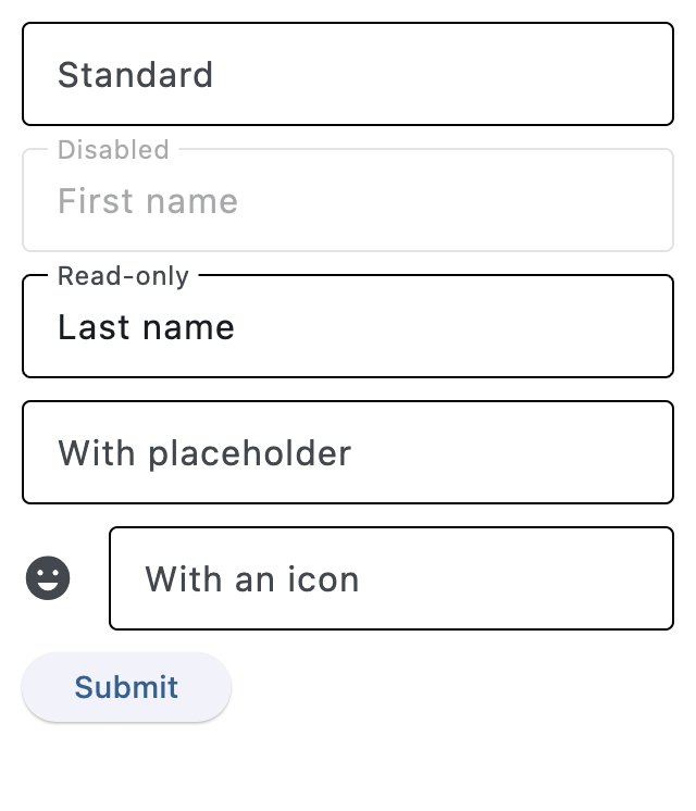
TextField
import flet as ft


def main(page: ft.Page):
    def handle_button_click(e: ft.Event[ft.Button]):
        message.value = (
            f"Textboxes values are:  '{tb1.value}', '{tb2.value}', "
            f"'{tb3.value}', '{tb4.value}', '{tb5.value}'."
        )

    page.add(
        ft.SafeArea(
            content=ft.Column(
                controls=[
                    tb1 := ft.TextField(label="Standard"),
                    tb2 := ft.TextField(
                        label="Disabled",
                        disabled=True,
                        value="First name",
                    ),
                    tb3 := ft.TextField(
                        label="Read-only",
                        read_only=True,
                        value="Last name",
                    ),
                    tb4 := ft.TextField(
                        label="With placeholder",
                        hint_text="Please enter text here",
                    ),
                    tb5 := ft.TextField(
                        label="With an icon",
                        icon=ft.Icons.EMOJI_EMOTIONS,
                    ),
                    ft.Button(content="Submit", on_click=handle_button_click),
                    message := ft.Text(),
                ],
            ),
        ),
    )


if __name__ == "__main__":
    ft.run(main)
Handling change events
import flet as ft


def main(page: ft.Page):
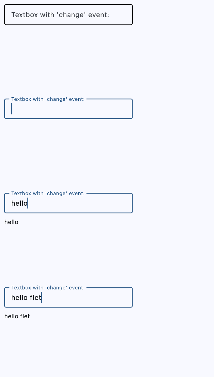
    def handle_field_change(e: ft.Event[ft.TextField]):
        message.value = e.control.value

    page.add(
        ft.SafeArea(
            content=ft.Column(
                controls=[
                    ft.TextField(
                        key="handling_change_textfield",
                        label="Textbox with 'change' event:",
                        on_change=handle_field_change,
                    ),
                    message := ft.Text(),
                ],
            ),
        ),
    )


if __name__ == "__main__":
    ft.run(main)
Handling selection changes
import flet as ft


def main(page: ft.Page):
    page.title = "Text selection"

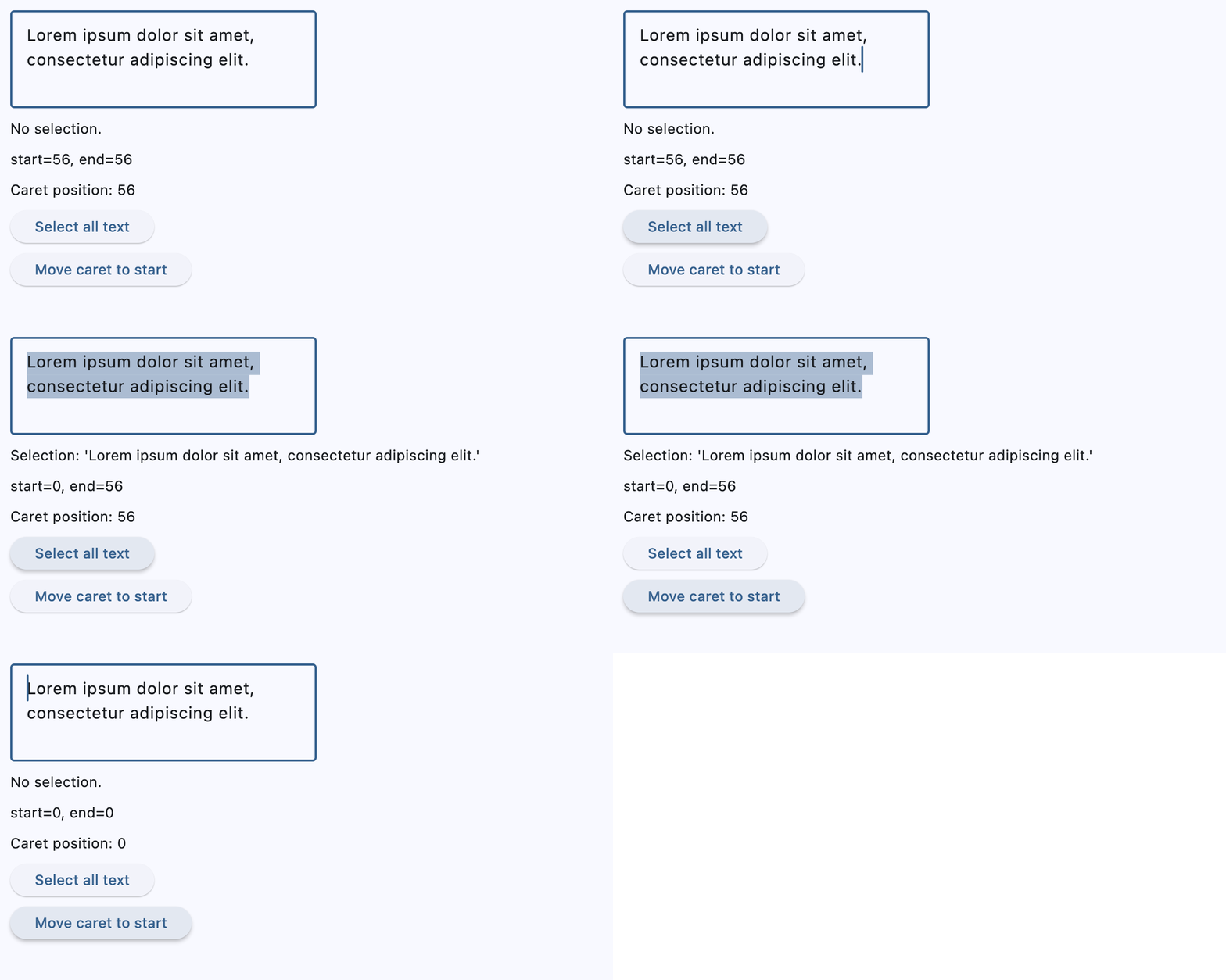
    def handle_selection_change(e: ft.TextSelectionChangeEvent[ft.TextField]):
        selection.value = (
            f"Selection: '{e.selected_text}'" if e.selected_text else "No selection."
        )
        selection_details.value = f"start={e.selection.start}, end={e.selection.end}"
        caret.value = f"Caret position: {e.selection.end}"

    async def select_characters(e: ft.Event[ft.Button]):
        await field.focus()
        field.selection = ft.TextSelection(
            base_offset=0, extent_offset=len(field.value)
        )

    async def move_caret(e: ft.Event[ft.Button]):
        await field.focus()
        field.selection = ft.TextSelection(base_offset=0, extent_offset=0)

    page.add(
        ft.SafeArea(
            content=ft.Column(
                spacing=10,
                controls=[
                    field := ft.TextField(
                        value=(
                            "Lorem ipsum dolor sit amet, consectetur adipiscing elit."
                        ),
                        multiline=True,
                        min_lines=3,
                        autofocus=True,
                        on_selection_change=handle_selection_change,
                    ),
                    selection := ft.Text("Select some text from the field."),
                    selection_details := ft.Text(),
                    caret := ft.Text("Caret position: -"),
                    ft.Button(
                        content="Select all text",
                        on_click=select_characters,
                    ),
                    ft.Button(
                        content="Move caret to start",
                        on_click=move_caret,
                    ),
                ],
            ),
        )
    )


if __name__ == "__main__":
    ft.run(main)
Password with reveal button
import flet as ft


def main(page: ft.Page):
    page.add(
        ft.SafeArea(
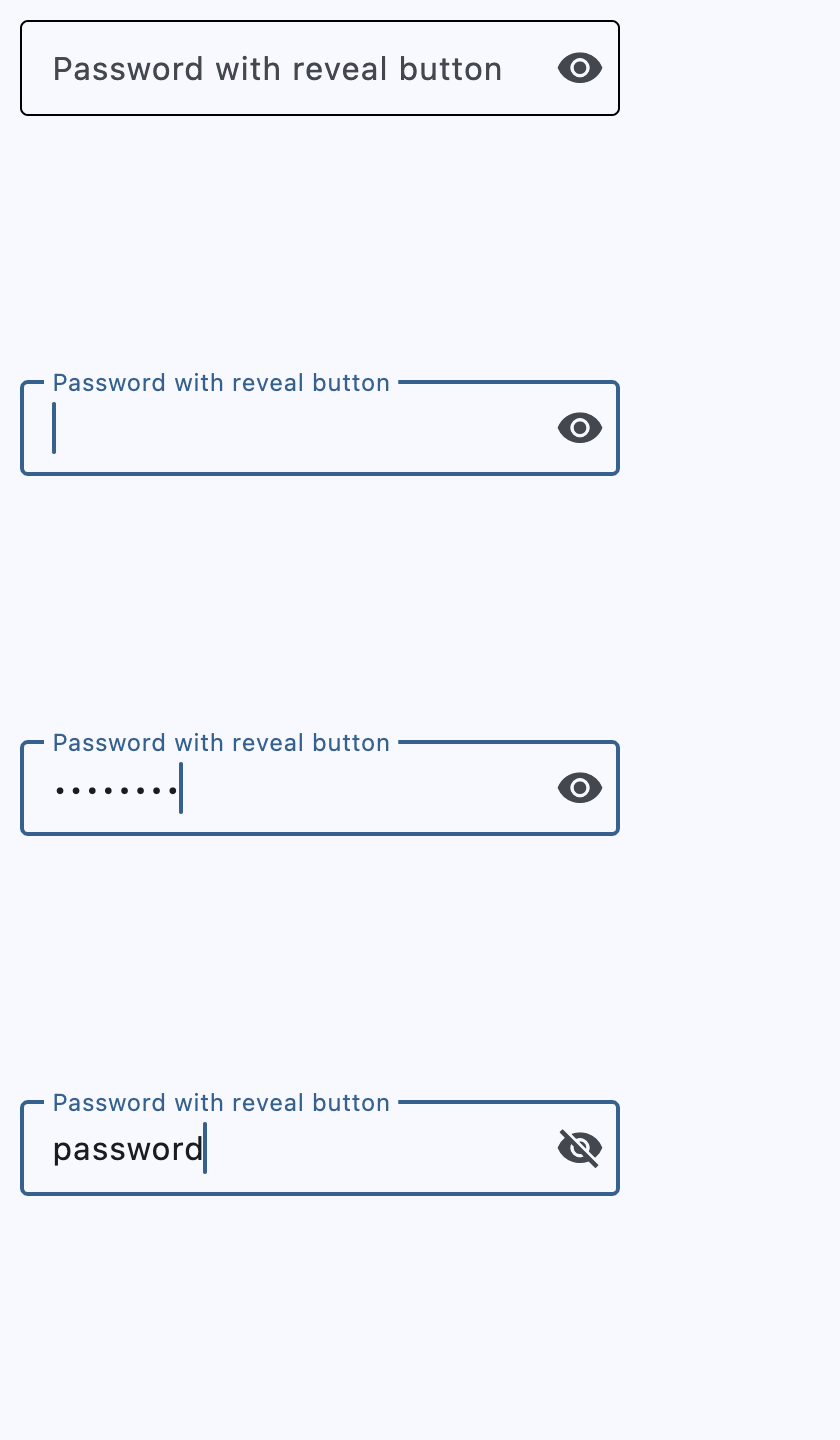
            content=ft.TextField(
                key="password_textfield",
                label="Password with reveal button",
                password=True,
                can_reveal_password=True,
            ),
        )
    )


if __name__ == "__main__":
    ft.run(main)
Multiline fields
import flet as ft


def main(page: ft.Page):
    page.add(
        ft.SafeArea(
            content=ft.Column(
                controls=[
                    ft.TextField(
                        key="multiline_standard",
                        label="Standard",
                        multiline=True,
                    ),
                    ft.TextField(
                        label="Disabled",
                        multiline=True,
                        disabled=True,
                        value="line1\nline2\nline3\nline4\nline5",
                    ),
                    ft.TextField(
                        key="multiline_auto_height",
                        label="Auto adjusted height with max lines",
                        multiline=True,
                        min_lines=1,
                        max_lines=3,
                    ),
                ],
            ),
        ),
    )


if __name__ == "__main__":
    ft.run(main)
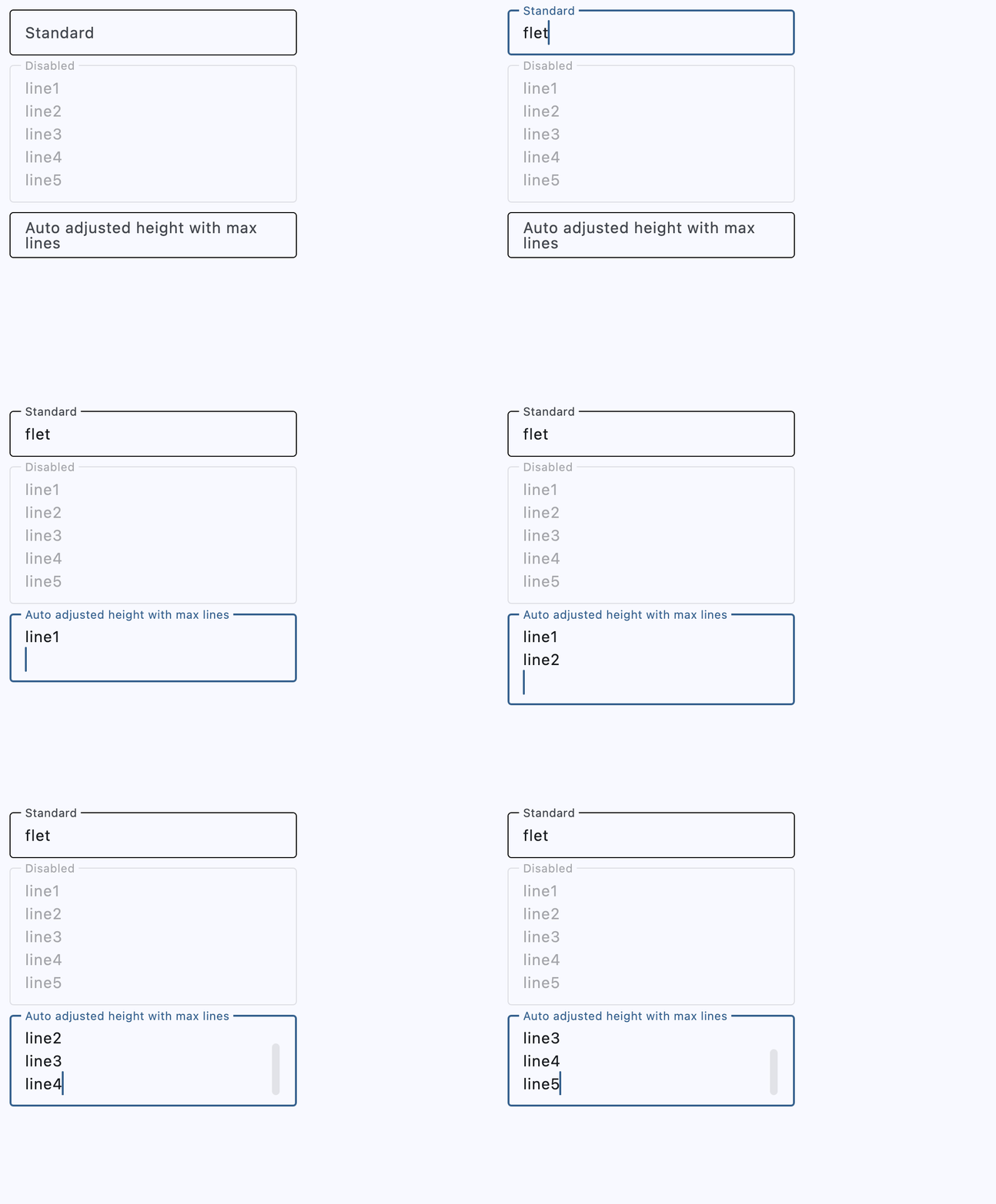
Underlined and borderless TextFields
import flet as ft


def main(page: ft.Page):
    page.add(
        ft.SafeArea(
            content=ft.Column(
                controls=[
                    ft.TextField(
                        key="underlined_field",
                        label="Underlined",
                        border=ft.UnderlineInputBorder(),
                        hint_text="Enter text here",
                    ),
                    ft.TextField(
                        key="underlined_filled_field",
                        label="Underlined filled",
                        border=ft.UnderlineInputBorder(),
                        filled=True,
                        hint_text="Enter text here",
                    ),
                    ft.TextField(
                        key="borderless_field",
                        label="Borderless",
                        border=ft.InputBorder.none(),
                        hint_text="Enter text here",
                    ),
                    ft.TextField(
                        key="borderless_filled_field",
                        label="Borderless filled",
                        border=ft.InputBorder.none(),
                        filled=True,
                        hint_text="Enter text here",
                    ),
                ],
            ),
        ),
    )


if __name__ == "__main__":
    ft.run(main)
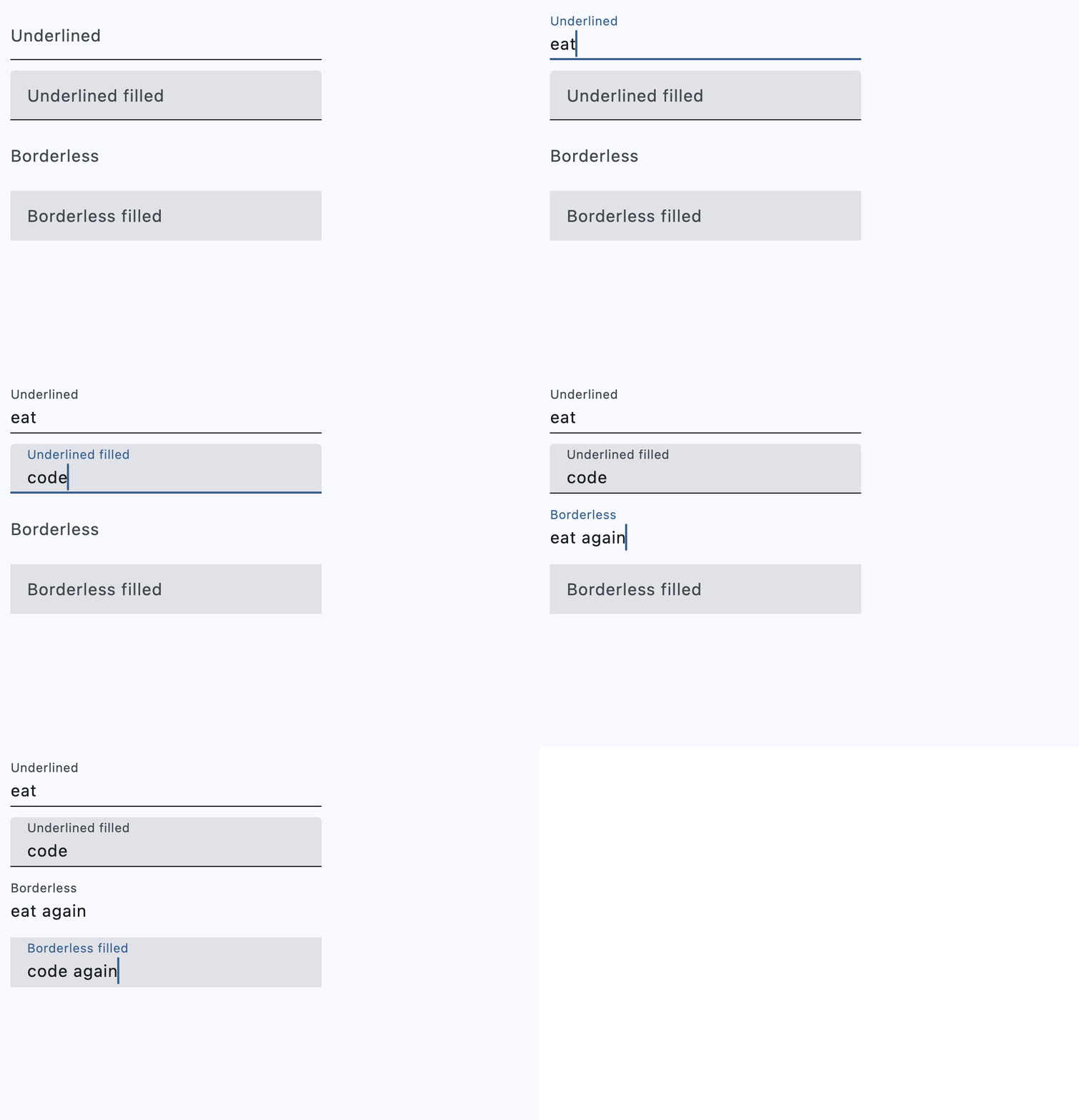
Setting prefixes and suffixes
import flet as ft


def main(page: ft.Page):
    def handle_button_click(e: ft.Event[ft.Button]):
        message.value = (
            "Textboxes values are: "
            f"'{prefix_field.value}', "
            f"'{suffix_field.value}', "
            f"'{prefix_suffix_field.value}', "
            f"'{color_field.value}'."
        )

    page.add(
        ft.SafeArea(
            content=ft.Column(
                controls=[
                    prefix_field := ft.TextField(
                        key="prefix_field",
                        label="With prefix",
                        prefix="https://",
                    ),
                    suffix_field := ft.TextField(
                        key="suffix_field",
                        label="With suffix",
                        suffix=".com",
                    ),
                    prefix_suffix_field := ft.TextField(
                        key="prefix_suffix_field",
                        label="With prefix and suffix",
                        prefix="https://",
                        suffix=".com",
                        enable_interactive_selection=True,
                    ),
                    color_field := ft.TextField(
                        key="color_field",
                        label="My favorite color",
                        icon=ft.Icons.FORMAT_SIZE,
                        hint_text="Type your favorite color",
                        helper="You can type only one color",
                        counter="{value_length}/{max_length} chars used",
                        prefix_icon=ft.Icons.COLOR_LENS,
                        suffix="...is your color",
                        max_length=20,
                    ),
                    ft.Button(
                        key="submit_button",
                        content="Submit",
                        on_click=handle_button_click,
                    ),
                    message := ft.Text(),
                ],
            ),
        ),
    )


if __name__ == "__main__":
    ft.run(main)
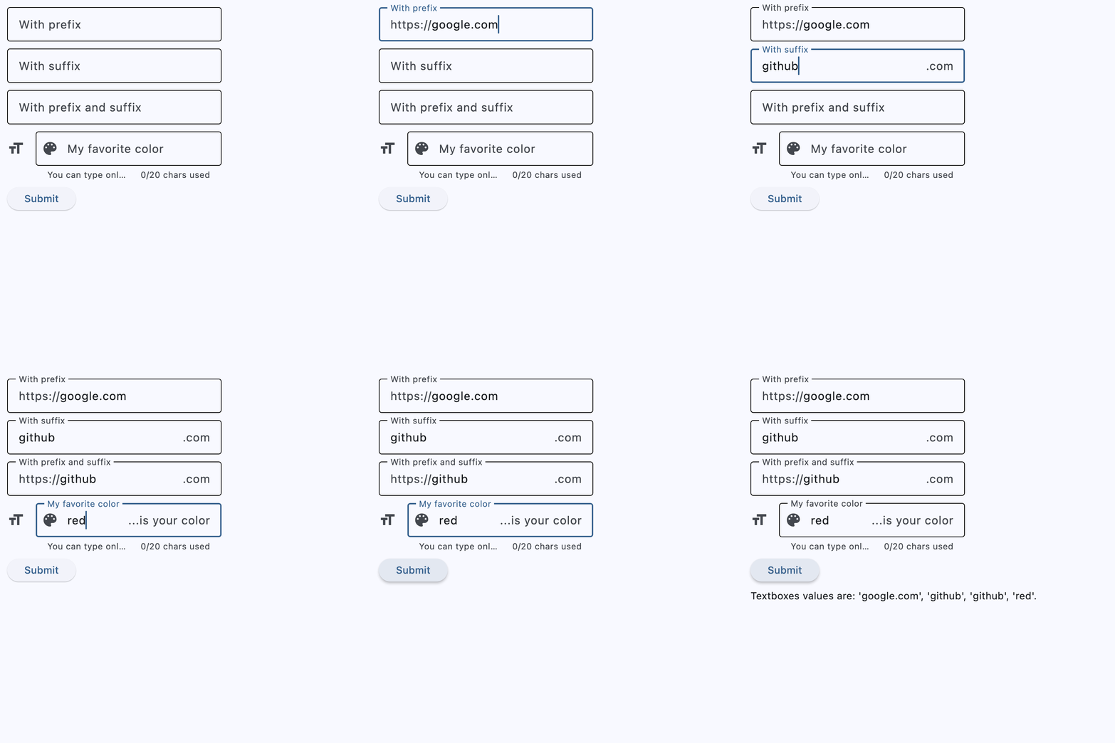
Styled TextField
import flet as ft


async def main(page: ft.Page):
    page.padding = 50

    tf = ft.TextField(
        key="styled_textfield",
        text_size=30,
        cursor_color=ft.Colors.RED,
        selection_color=ft.Colors.YELLOW,
        color=ft.Colors.PINK,
        bgcolor=ft.Colors.BLACK_26,
        filled=True,
        focused_color=ft.Colors.GREEN,
        focused_bgcolor=ft.Colors.CYAN_200,
        border={
            ft.ControlState.DEFAULT: ft.OutlineInputBorder(
                border_radius=30,
                side=ft.BorderSide(color=ft.Colors.GREEN_800),
            ),
            ft.ControlState.FOCUSED: ft.OutlineInputBorder(
                border_radius=30,
                side=ft.BorderSide(width=2, color=ft.Colors.GREEN_ACCENT_400),
            ),
        },
        max_length=20,
        capitalization=ft.TextCapitalization.CHARACTERS,
    )

    page.add(
        ft.SafeArea(
            content=tf,
        )
    )


if __name__ == "__main__":
    ft.run(main)
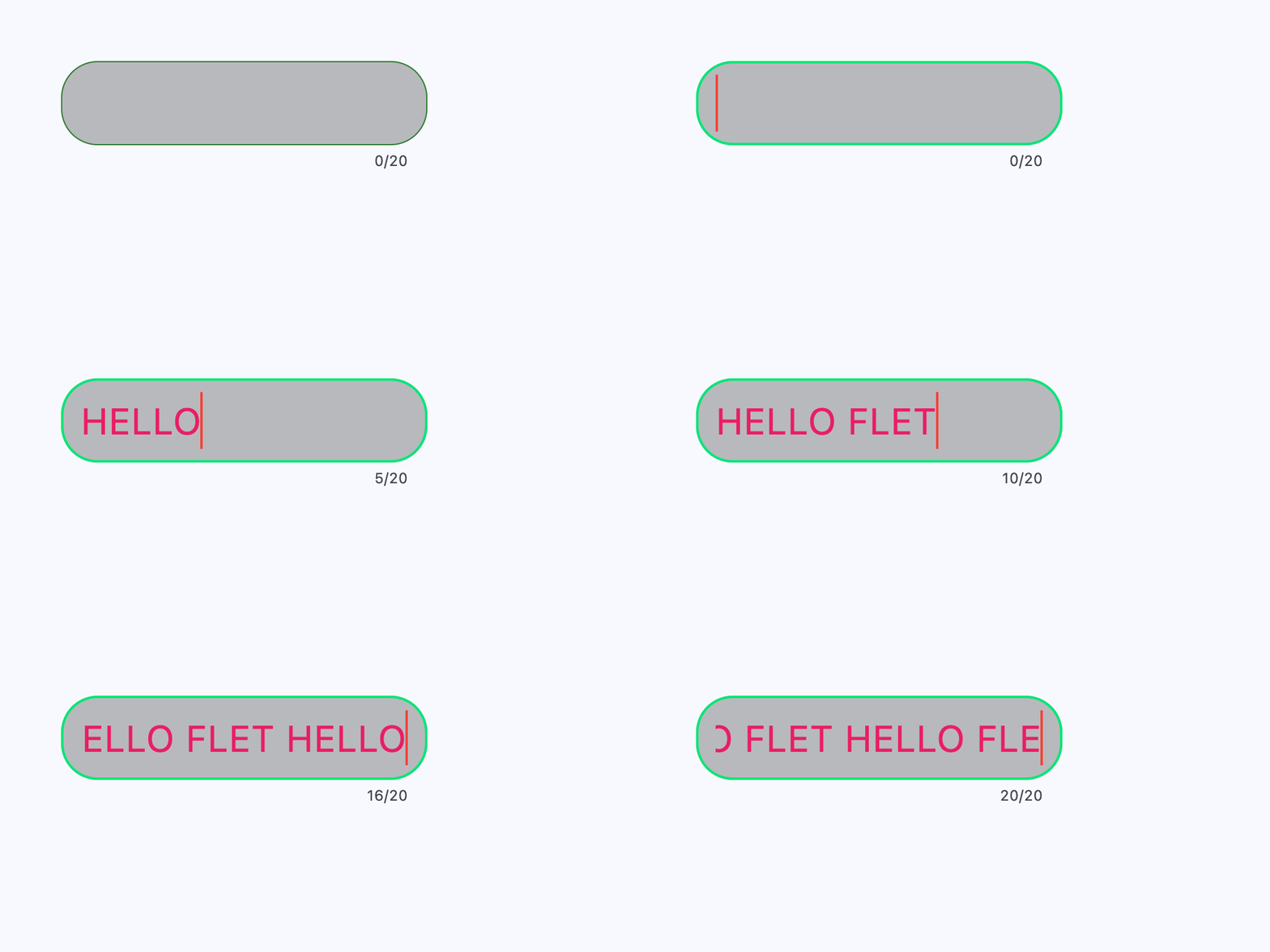
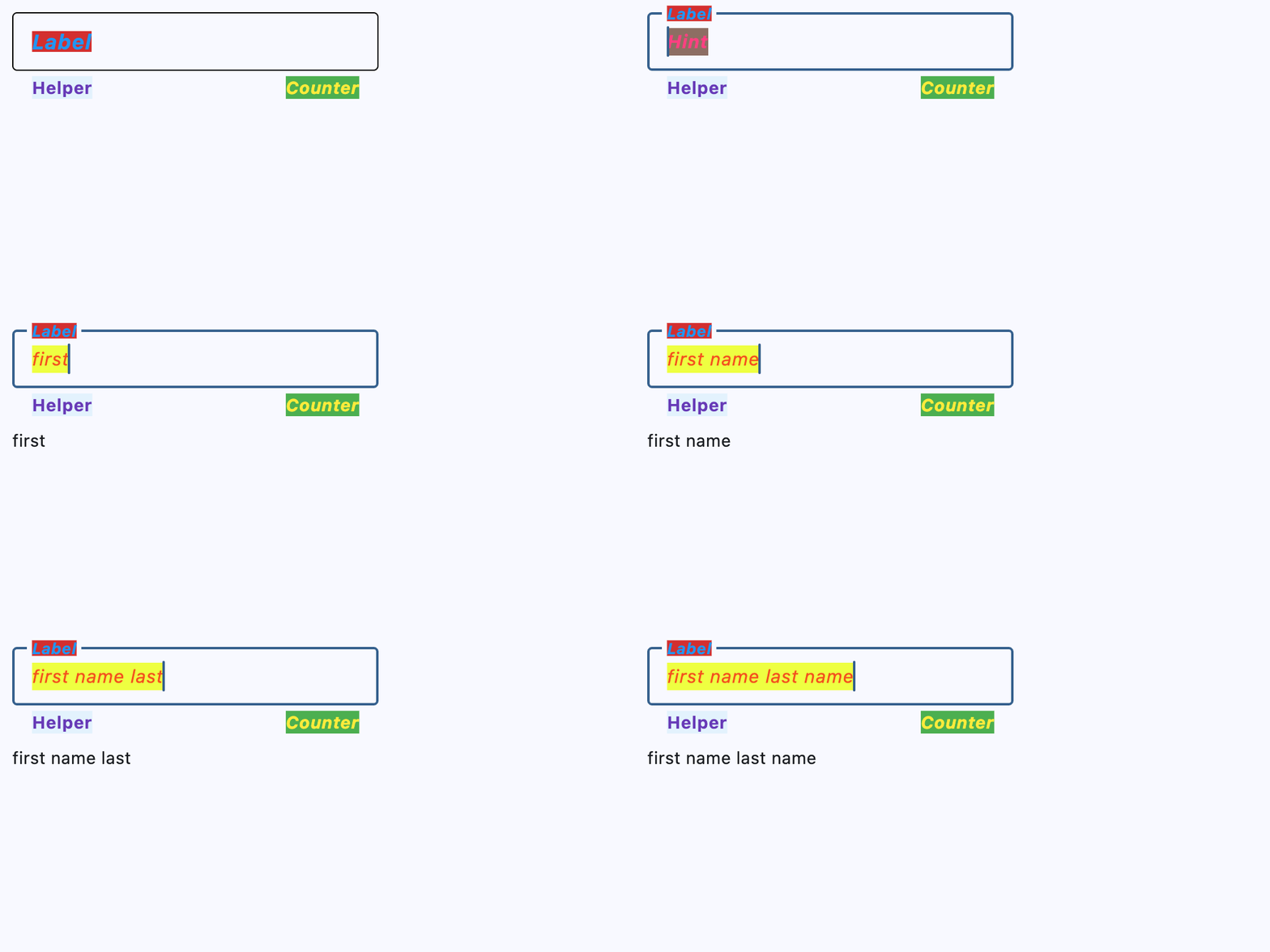
Custom label, hint, helper, and counter texts and styles
import flet as ft


def main(page: ft.Page):
    page.theme_mode = ft.ThemeMode.LIGHT

    def handle_field_change(e: ft.Event[ft.TextField]):
        message.value = e.control.value

    page.add(
        ft.SafeArea(
            content=ft.Column(
                controls=[
                    ft.TextField(
                        key="label_hint_helper_counter_textfield",
                        on_change=handle_field_change,
                        text_style=ft.TextStyle(
                            size=15,
                            italic=True,
                            color=ft.Colors.DEEP_ORANGE_600,
                            bgcolor=ft.Colors.LIME_ACCENT_200,
                        ),
                        label="Label",
                        label_style=ft.TextStyle(
                            size=17,
                            weight=ft.FontWeight.BOLD,
                            italic=True,
                            color=ft.Colors.BLUE,
                            bgcolor=ft.Colors.RED_700,
                        ),
                        hint_text="Hint",
                        hint_style=ft.TextStyle(
                            size=15,
                            weight=ft.FontWeight.BOLD,
                            italic=True,
                            color=ft.Colors.PINK_ACCENT,
                            bgcolor=ft.Colors.BROWN_400,
                        ),
                        helper="Helper",
                        helper_style=ft.TextStyle(
                            size=14,
                            weight=ft.FontWeight.BOLD,
                            color=ft.Colors.DEEP_PURPLE,
                            bgcolor=ft.Colors.BLUE_50,
                        ),
                        counter="Counter",
                        counter_style=ft.TextStyle(
                            size=14,
                            italic=True,
                            color=ft.Colors.YELLOW,
                            bgcolor=ft.Colors.GREEN_500,
                        ),
                    ),
                    message := ft.Text(),
                ],
            ),
        ),
    )


if __name__ == "__main__":
    ft.run(main)
Properties
always_call_on_tapclass-attributeinstance-attribute
always_call_on_tap: bool = FalseWhether on_click should be called for every tap.
By default, only the first tap in a tap sequence triggers on_click.
When enabled, consecutive taps trigger it as well.
animate_cursor_opacityclass-attributeinstance-attribute
animate_cursor_opacity: bool | None = NoneWhether the text cursor animates between transparent and opaque during each blink.
If not set, the default follows the platform behavior used by Flet.
autocorrectclass-attributeinstance-attribute
autocorrect: bool = TrueWhether to enable autocorrection.
autofill_hintsclass-attributeinstance-attribute
autofill_hints: AutofillHint | list[AutofillHint] | None = (
    None
)
Helps the autofill service identify the type of this text input.
More information here.
autofocusclass-attributeinstance-attribute
autofocus: bool = FalseTrue if the control will be selected as the initial focus. If there is more than one control on a page with autofocus set, then the first one added to the page will get focus.
can_request_focusclass-attributeinstance-attribute
can_request_focus: bool = TrueWhether this field can request focus.
If set to False, the field does not request focus when tapped or when its
context menu is shown, and it cannot be reached with keyboard focus traversal.
can_reveal_passwordclass-attributeinstance-attribute
can_reveal_password: bool = FalseDisplays a toggle icon button that allows revealing the entered password. Is shown if both password and can_reveal_password are True.
The icon is displayed in the same location as FormFieldControl.suffix
and in case both can_reveal_password/password and suffix are
provided, then the FormFieldControl.suffix won't be shown.
capitalizationclass-attributeinstance-attribute
capitalization: TextCapitalization | None = NoneEnables automatic on-the-fly capitalization of entered text.
Defaults to TextCapitalization.NONE.
clip_behaviorclass-attributeinstance-attribute
clip_behavior: ClipBehavior = ClipBehavior.HARD_EDGEHow the field's contents should be clipped.
See ClipBehavior for the available clipping modes.
cursor_colorclass-attributeinstance-attribute
cursor_color: ColorValue | None = NoneThe color of TextField cursor.
cursor_error_colorclass-attributeinstance-attribute
cursor_error_color: ColorValue | None = NoneThe color of the text cursor while the field is showing an error.
If not set, the cursor color falls back to the error text style and then to the theme's error color.
cursor_heightclass-attributeinstance-attribute
cursor_height: Number | None = NoneSets cursor height.
cursor_radiusclass-attributeinstance-attribute
cursor_radius: Number | None = NoneSets cursor radius.
enable_ime_personalized_learningclass-attributeinstance-attribute
enable_ime_personalized_learning: bool = TrueWhether the input method is allowed to learn from what the user types.
This affects Android only and controls personalized data such as typing history and user dictionary entries.
enable_interactive_selectionclass-attributeinstance-attribute
enable_interactive_selection: bool = TrueWhether interactive text selection is enabled.
When enabled, users can move the caret, select text, and use the cut/copy/paste menu. When disabled, selection cannot be adjusted interactively and editing shortcuts for cut/copy/paste are suppressed.
enable_stylus_handwritingclass-attributeinstance-attribute
enable_stylus_handwriting: bool = TrueWhether this field supports stylus handwriting input.
On supported devices, the user can write directly on top of the field with a stylus instead of typing from the keyboard.
enable_suggestionsclass-attributeinstance-attribute
enable_suggestions: bool = TrueWhether to show input suggestions as the user types.
This flag only affects Android. On iOS, suggestions are tied directly to
autocorrect, so that suggestions are only shown when autocorrect is True.
On Android autocorrection and suggestion are controlled separately.
ignore_pointersclass-attributeinstance-attribute
ignore_pointers: bool = FalseWhether this field ignores pointer events.
ignore_up_down_keysclass-attributeinstance-attribute
ignore_up_down_keys: bool = FalseWhether to intercept Arrow-Up and Arrow-Down when this field has focus.
When set to True, pressing those keys does not move the caret to the beginning
or end of the text respectively.
input_filterclass-attributeinstance-attribute
input_filter: InputFilter | None = NoneProvides as-you-type filtering/validation.
Similar to the on_change callback, the input filters are not applied
when the content of the field is changed programmatically.
keyboard_brightnessclass-attributeinstance-attribute
keyboard_brightness: Brightness | None = NoneThe brightness to use for the onscreen keyboard.
This setting is honored on iOS only.
keyboard_typeclass-attributeinstance-attribute
keyboard_type: KeyboardType = KeyboardType.TEXTThe type of keyboard to use for editing the text.
max_lengthclass-attributeinstance-attribute
max_length: int | None = NoneLimits a maximum number of characters that can be entered into TextField.
Raises:
- ValueError - If it is not strictly greater than
0or equal to-1.
max_linesclass-attributeinstance-attribute
max_lines: int | None = NoneThe maximum number of lines to show at one time, wrapping if necessary.
This affects the height of the field itself and does not limit the number of lines that can be entered into the field.
If this is 1 (the default), the text will not wrap, but will scroll horizontally
instead.
Raises:
- ValueError - If it is not strictly greater than
0. - ValueError - If it is not greater than or equal to
min_lineswhen both are set.
min_linesclass-attributeinstance-attribute
min_lines: int | None = NoneThe minimum number of lines to occupy when the content spans fewer lines.
This affects the height of the field itself and does not limit the number of lines that can be entered into the field.
Defaults to 1.
Raises:
- ValueError - If it is not strictly greater than
0. - ValueError - If it is not less than or equal to
max_lineswhen both are set.
mouse_cursorclass-attributeinstance-attribute
mouse_cursor: MouseCursor | None = NoneThe mouse pointer to show while hovering over the field.
If not set, the standard text cursor is used.
multilineclass-attributeinstance-attribute
multiline: bool = FalseWhether this field can contain multiple lines of text.
obscuring_characterclass-attributeinstance-attribute
obscuring_character: str = '•'The single character used to mask the text when password is True.
passwordclass-attributeinstance-attribute
password: bool = FalseWhether to hide the text being edited.
read_onlyclass-attributeinstance-attribute
read_only: bool = FalseWhether the text can be changed.
When this is set to True, the text cannot be modified by any shortcut or keyboard
operation. The text is still selectable.
scroll_paddingclass-attributeinstance-attribute
scroll_padding: PaddingValue = 20Padding to keep around the field when a surrounding scrollable scrolls it into view.
When the field receives focus and is partly hidden, for example by the onscreen keyboard, this padding helps keep space between the field and the edges of the surrounding scrollable after scrolling.
selectionclass-attributeinstance-attribute
selection: TextSelection | None = NoneRepresents the current text selection or caret position in the field.
When the user selects text, this property is updated to reflect the selected range. If no text is selected, it contains an empty range indicating the caret position.
Setting this property visually updates the field's selection to match the given
value, and hence leads to the on_selection_change event being triggered.
To ensure the selection is visible and the event is fired, the text field must
be focused. Call FormFieldControl.focus
on the field before setting this property.
selection_colorclass-attributeinstance-attribute
selection_color: ColorValue | None = NoneThe color of TextField selection.
shift_enterclass-attributeinstance-attribute
shift_enter: bool = FalseChanges the behavior of Enter button in multiline textfield to be chat-like, i.e. new line can be added with Shift+Enter and pressing just Enter fires on_submit event.
show_cursorclass-attributeinstance-attribute
show_cursor: bool = TrueWhether the field's cursor is to be shown.
smart_dashes_typeclass-attributeinstance-attribute
smart_dashes_type: bool = TrueWhether to allow the platform to automatically format dashes.
This flag only affects iOS versions 11 and above. As an example of what this does, two consecutive hyphen characters will be automatically replaced with one en dash, and three consecutive hyphens will become one em dash.
smart_quotes_typeclass-attributeinstance-attribute
smart_quotes_type: bool = TrueWhether to allow the platform to automatically format quotes.
This flag only affects iOS. As an example of what this does, a standard vertical double quote character will be automatically replaced by a left or right double quote depending on its position in a word.
strut_styleclass-attributeinstance-attribute
strut_style: StrutStyle | None = NoneThe StrutStyle used for vertical text layout.
Strut style establishes a predictable minimum line height, which is useful when entered text may vary in font metrics or script.
text_alignclass-attributeinstance-attribute
text_align: TextAlign | None = NoneHow the text should be aligned horizontally.
Defaults to TextAlign.LEFT.
Events
on_blurclass-attributeinstance-attribute
on_blur: ControlEventHandler[TextField] | None = NoneCalled when the control has lost focus.
on_changeclass-attributeinstance-attribute
on_change: ControlEventHandler[TextField] | None = NoneCalled when the typed input for the TextField has changed.
on_clickclass-attributeinstance-attribute
on_click: ControlEventHandler[TextField] | None = NoneCalled when the field is tapped.
If always_call_on_tap is True, this event is also triggered for
consecutive taps.
on_focusclass-attributeinstance-attribute
on_focus: ControlEventHandler[TextField] | None = NoneCalled when the control has received focus.
on_selection_changeclass-attributeinstance-attribute
on_selection_change: (
    EventHandler[TextSelectionChangeEvent[TextField]] | None
) = None
Called when the text selection or caret position changes.
This can be triggered either by user interaction (selecting text or moving
the caret) or programmatically (through the selection property).
on_submitclass-attributeinstance-attribute
on_submit: ControlEventHandler[TextField] | None = NoneCalled when user presses ENTER while focus is on TextField.
on_tap_outsideclass-attributeinstance-attribute
on_tap_outside: ControlEventHandler[TextField] | None = NoneCalled when a pointer-down event occurs outside the field while it is focused.
Use this to react when the user taps away from the field.
This callback is a notification only and does not include the pointer event details.